In data-heavy reports like Repeat Customer Insights' Cohort Report it can be difficult to understand what the data is telling you.
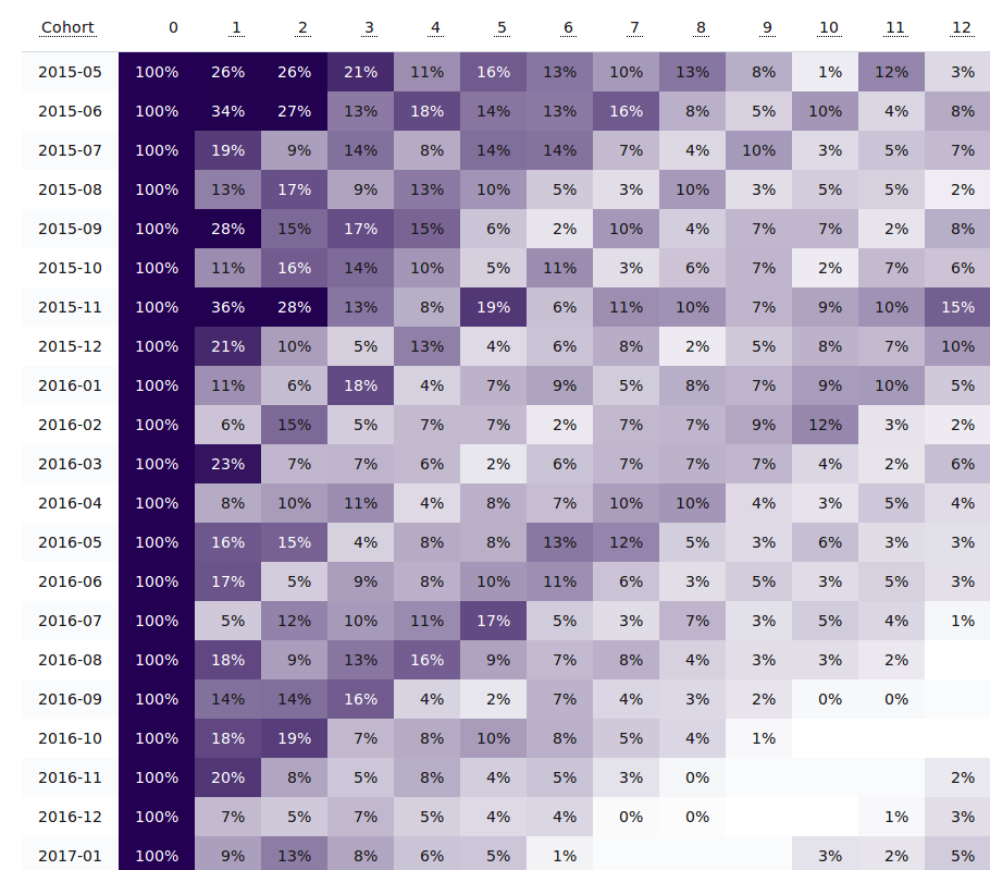
That's why the report uses shading in addition to the values.
The shading is automatic and makes it easier to spot changes, trends, and outliers without having to read and compare every single cell.
For example, in the sample above for the first cohort there was a small jump in orders in October (column 5) and a major drop in March of the next year (column 10).
That's easier than reading 11%, 16%, 13%, 10%, 13%... "hmm, I guess that 16% was a good month"... 8%, 1%, 12%, 3%... "wait, what happened to cause that 1% month?"
If you're not using Repeat Customer Insights yet, a simple install is all it takes to have it start compiling these cohort reports for you.
You might be surprised at how many ideas are just sitting there in your data.
Eric Davis
Learn which products build the best customers
Find which products create the most valuable customers with the First Product Analysis in Repeat Customer Insights. It goes beyond your best sellers by looking at long-term purchasing and retention behavior of your customers.