Evaluating how a single cohort behaves can draw some useful conclusions, but it's even more valuable to compare different cohorts.
You can compare cohorts:
- For the same time after the first order, by using the vertical column
- For the same calendar month, by looking for diagonals that go from the top right to the bottom left
The first is easy to understand. You're just looking for major differences that line up vertically.
But the diagonals can be a bit confusing to understand even if our eyes can spot them easily.
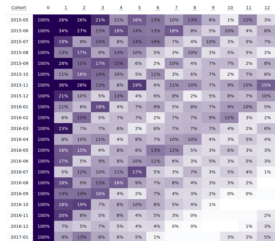
Using the sample cohort report above, there's a clear diagonal trend starting in the 11th month of the first cohort (row 2015-05).
Since that's the 11th month, that would be April 2016 (2015-05 plus 11 months).
The next row starts with 2015-06 and the trend appears in the 10th month, which is also April 2016.
The trend ends with the cohort that first ordered in April 2016.
By virtue of how the cohort reports work, any diagonal trend like this is because there was some major behavior change in one calendar month that caused many of the past cohorts to reorder.
Usually this is a major promotion, a marketing event or launch, or strong seasonality.
It could have been a spring clearance, or a tax-day sale, or a product-specific trend like the year's swimsuits coming in stock.
Whatever the case, it's something that should be analyzed and replicated.
If you haven't installed Repeat Customer Insights yet, it's an easy way to get a detailed look at your customer behavior just like the sample cohort report above.
Eric Davis
Go beyond Average Order Value
Go beyond just Average Order Value and learn how your customers perform in various metrics.